
If you’re a UX designer (or aspire to be one), you’ve probably noticed how generative AI tools are popping up like mushrooms after the rain. Remember when ChatGPT waltzed onto the scene in late 2022? Well, it kicked off an AI craze that’s not just a flash in the pan — it’s changing the face of the UX design industry.
If you’ve tried Googling AI design tools lately, you’re not alone, as search volume for AI tools has skyrocketed a whopping 1700% between 2022 and 2023. The popularity of these tools has some designers worried — especially since MIT Technology Review revealed 89% accuracy for AI going solo on design tasks.
Here at Playbook, we believe that design will always require the human touch, but learning to harness AI-powered design tools can boost both productivity and creativity. But let’s be real: with this avalanche of new tools, it can feel like you’re drowning in options — it’s a bit like choosing which show to binge-watch next.
Fortunately for you, the Playbook team has had its ear to the ground, and has rounded up some of the emerging tools UX designers should keep an eye on.
So let’s dive into the list of potential AI sidekicks for your design adventures.
7 effective AI tools to supercharge your UX design
1. Framer AI: the intuitive website creator
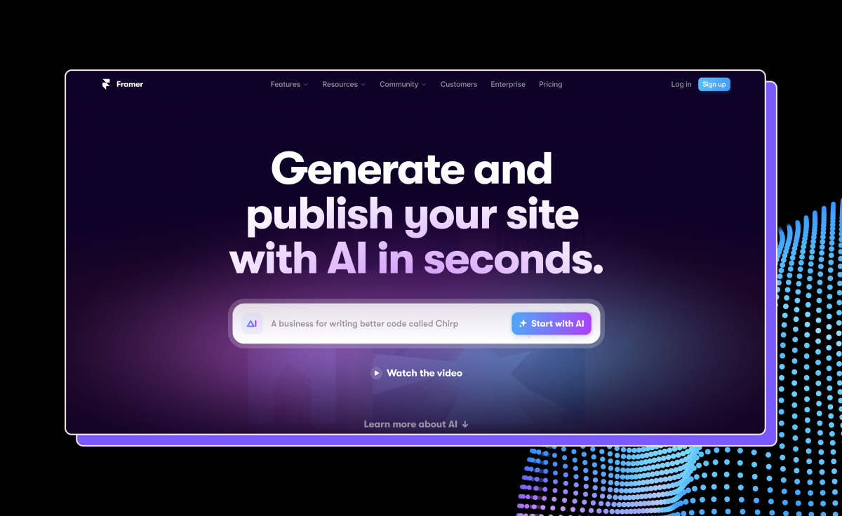
First up is Framer AI, an intuitive website creator with a basic free plan and $5 and $15 plans with more features and functionality.
With its no-code website design assistant, Framer AI can help you create websites without getting tangled in code. All you have to do is give it a prompt, and it will whip you up a website. You also get to play mixologist with display fonts, text fonts, and color palettes.
Some of the pros of Framer AI include:
- Freeform canvas: Get creative with a canvas that doesn’t box you in.
- Figma plugin: For Figma lovers, there’s a handy plug-in for a more integrated experience.
- SEO optimization: Framer helps you get found on search engines.
- Plugins: Extend functionality with a plethora of plugins.
But no rose without a thorn, right? Here are some of the potential drawbacks of Framer AI:
- Steep learning curve: Framer AI has a bit of a ‘learn the ropes’ vibe, so patience is key.
- Limited free plan: The free version is great for starters but might leave you craving more.
- No e-commerce features: If you’re looking to set up shop online, Framer AI hasn’t built that bridge yet.
2. Uizard: AI-powered prototyping
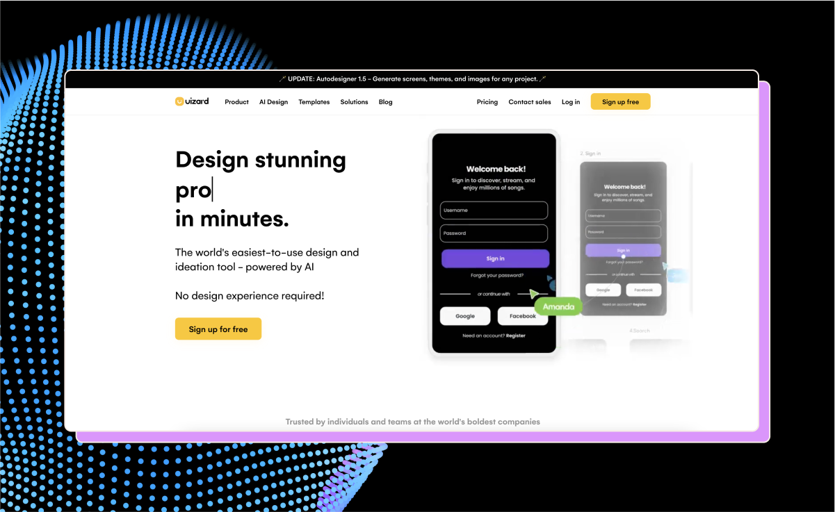
Uizard.io is like the cool cousin of Figma, but with an AI twist. For instance, its scan-and-convert feature can turn your sketches into designs in seconds, make images editable, and create low-fidelity wireframes out of detailed designs.
Ever wonder where users might look first? The platform’s attention heatmap feature provides a visual prediction of where users’ eyes may land, informing design decisions with insights into visual hierarchy.
If you’re a visual whiz but struggle with crafting copy, Uizard’s AI text assistant can help you finesse your messaging to resonate with your audience.
Uizard offers a free plan, with an upgrade of $12 a month per creator.
The pros of Uizard include:
- AI-powered features: Including wireframes to heatmaps.
- Scan to design: Digitally refine hand-drawn wireframes with ease.
- Editable screenshot conversion: Turn inspiration into your creations.
- AI text assistant: Get help to polish up your UI copy.
- Low-fi wireframe conversion: Visualize early-stage designs without starting from scratch.
Of course, it has its cons, too, including:
- Auto-designer exclusivity: The cool auto-design feature is behind a paywall — and a waitlist.
- Free plan limitations: As expected, the free version has its limits, nudging you towards the paid upgrade.
3. QoQo.AI: the UX researcher’s sidekick

Here’s one for the Figma fanatics: Qoqo.ai could become your new favorite plugin, bringing the power of AI to the creation of user personas, journey maps, and more.
Here’s how it works: you hop into Figma, pop open Qoqo.ai, and start typing into the content fields — let’s say you’re detailing out a persona. Hit ‘generate’, and Qoqo whips up auto-generated ‘cards’ that delve into your user’s goals, needs, motivations, frustrations, and opportunities.
And Qoqo doesn’t stop at personas — it sketches out the whole user journey, complete with likely actions, mindset shifts, and those pesky pain points.
Remember, Qoqo.ai isn’t here to replace good ol’ research; think of it more as your research assistant. It speeds up the process, giving you a head start in understanding your users, but it’s no substitute for diving deep into actual user insights.
Qoqo.ai pros:
- UX personas: Qoqo creates detailed user profiles.
- Design process: Helps keep your design process neat and organized.
- Key element detector: Pinpoints what matters most in your design.
- Challenge spotlight: Throws a light on potential hurdles before you stumble.
- Figma-friendly: Sits right within Figma, so it’s always at hand.
Cons:
- Figma-only party: If you don’t use Figma, you’re out of luck — it’s the only place Qoqo lives.
- Standalone app? Nope: It’s all plugin, no standalone app, tethering you to Figma.
- Privacy question marks: The details on data privacy are a bit hush-hush.
- Persona specialist: It’s all about personas, without extending into other UX territories.
- Can’t replace humans (yet): It’s no stand-in for in-depth user research and insights.
- Context clueless: Might not always grasp the nuanced context of your project.
4. LetsEnhance: the image magician
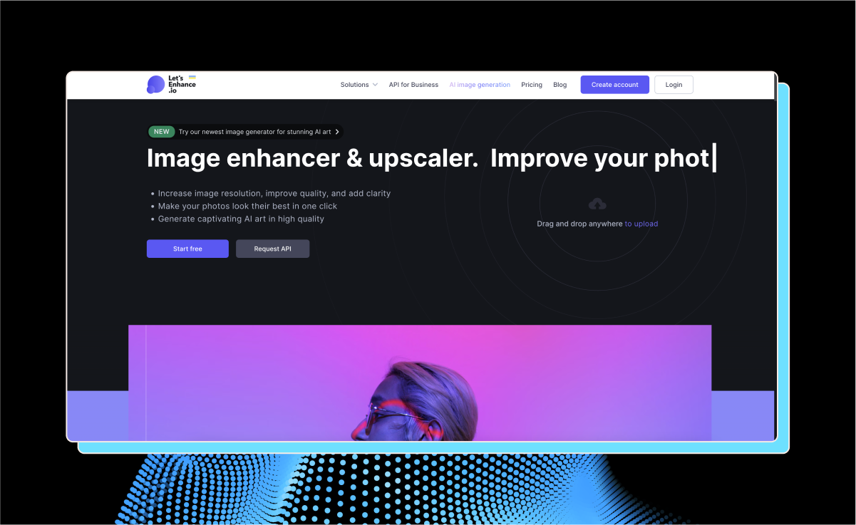
LetsEnhance is a photo enhancement platform that turns low-res images into clear, detailed ones — similar to Playbook’s Stable Diffusion-powered Upscale feature.
LetsEnhance offers a free plan with a $9 upgrade for more advanced features.
Its pros include:
- Efficiency: An easy, no-frills image enhancer.
- No-brainer interface: Jump in and get going straight away.
- Detail dynamo: It sharpens images and recovers lost details.
Cons:
- Price tag stings a bit: It’s not the cheapest show in town. Forking out $108/year when there’s a $99 lifetime option elsewhere might have you raising an eyebrow. Plus, the pay-as-you-go rate of $0.45/photo could add up quickly for heavy users.
- Forgetful by nature: Here today, gone tomorrow — it doesn’t save your upscaled photos, which could be a deal-breaker if you’re looking for a more permanent solution.
5. Claid.AI: the one-click scene setter for product images
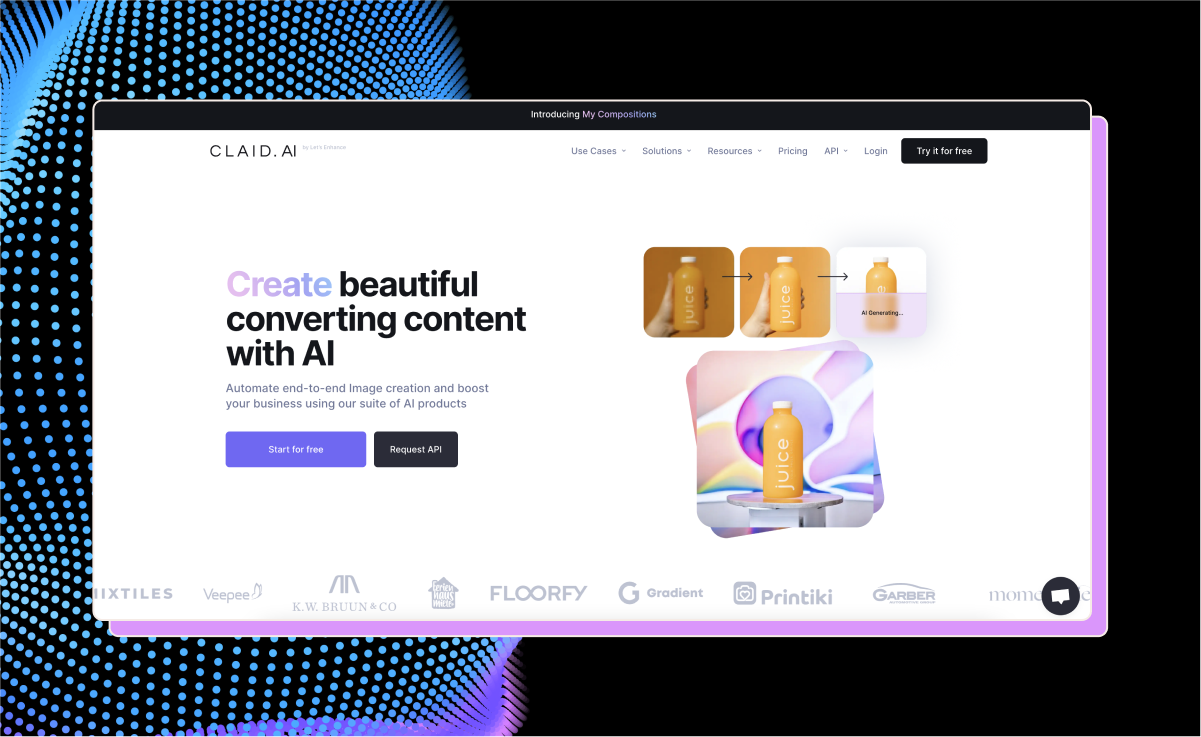
Venturing into the realm of product display, Claid.ai is the latest offering from the creators of LetsEnhance, designed to make your product images pop off the screen. For $19 a month, with an option to rev up to a $49 tier, Claid.ai simplifies the product image creation process.
With Claid.ai, you can place products in any scenario you desire while keeping the background clean and professional.
Pros:
- Automatic photo enhancement: Just upload and let Claid.ai handle the complex edits, saving you time and hassle.
- True-to-life enlargements: Increase the size of your images without the pixelated nightmares.
- Color correction: It understands the mood you’re after and adjusts the palette to perfection.
- Resolution revolution: Claid.ai upgrades your images to high-resolution.
- User-generated content (UGC): Claid.ai knows the value of UGC and ensures automatic editing for a consistent look.
Cons:
- Editing options are basic: It’s not Photoshop; the editing toolkit is somewhat elementary.
- Garbage in, garbage out: The output quality heavily relies on the original UGC quality.
- Video who? Moving pictures don’t get love here; Claid.ai sticks to stills.
- Language barriers: Non-English speakers won’t find multilingual support here.
- API limits: The service caps the number of API calls, which could be a bottleneck for heavy users.
- Some assembly required: Integrating the API isn’t plug-and-play—you’ll need some tech chops.
- No on-the-go edits: In a mobile-first world, the lack of an app might leave some users wanting more.
6. Cleanup.Pictures: the precision-crafted background eraser
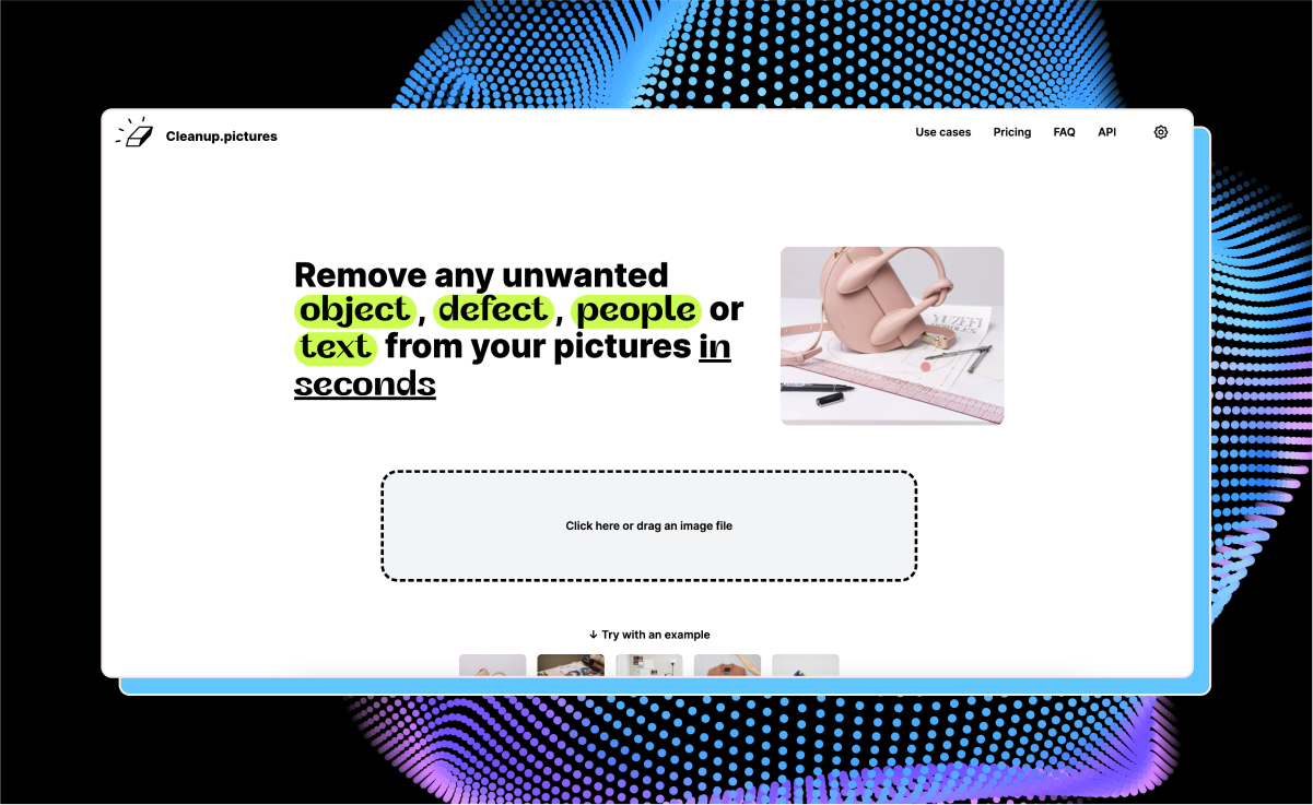
For the discerning designer who’s ever been thwarted by an unwanted background, Cleanup.pictures is similar to Playbook’s background removal feature powered by Remove.bg.
Both platforms provide a precise and intuitive digital eraser, enabling you to remove elements from the background while leaving the rest of the image intact.
Cleanup.pictures costs $5 per month or $36 per year.
Pros:
- Versatility: Whether you’re a social media maven or a web designer, this tool fits a spectrum of use cases.
- No learning curve: The interface is friendly and easy to use.
- Seamless finish: Say goodbye to the ghostly, blurry outlines often left by less capable tools.
Cons:
- Zoom out: You might miss the ability to zoom in for those intricate details — precision has its limits here.
- One at a time, please: If you’re looking to process a bunch of images at once, you’ll need to look elsewhere. Batch processing isn’t in this tool’s vocabulary.
7. Attention Insight: The Crystal Ball for Your Design’s Visual Impact
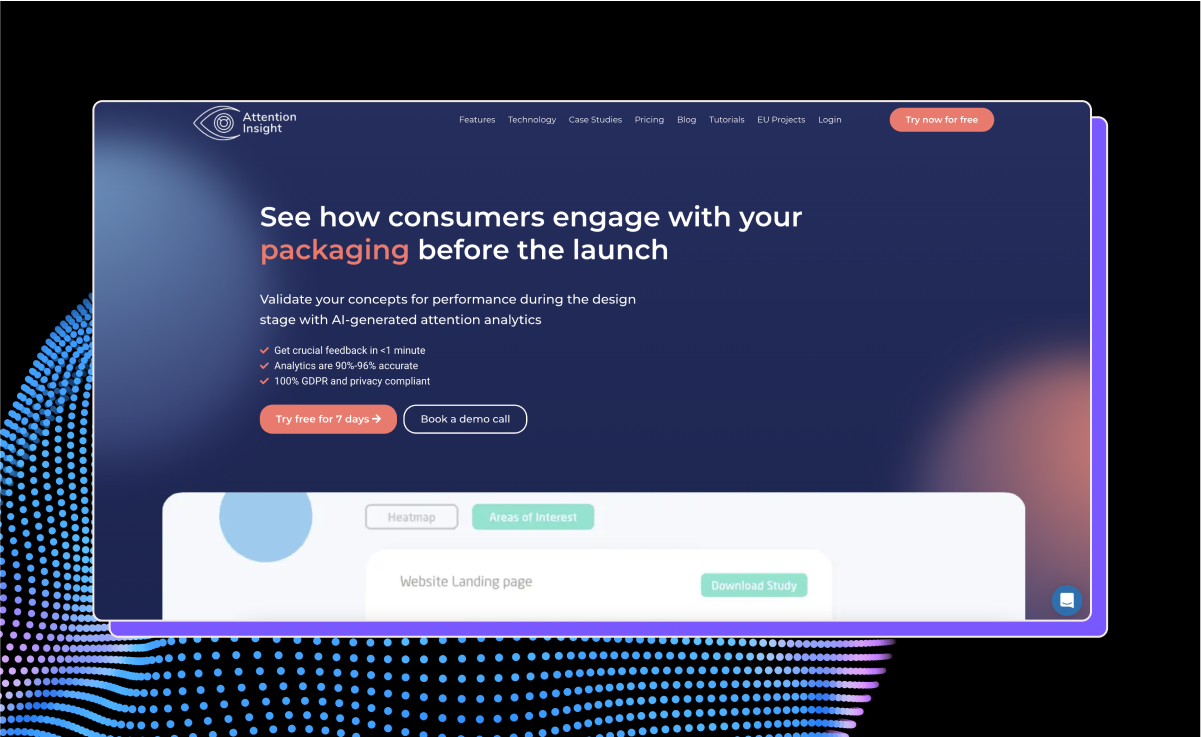
In a world where first impressions are everything, Attention Insight offers a glimpse into the future of your design’s impact.
Using advanced algorithms, it predicts where a viewer’s gaze might land on your website or app design. This isn’t your average heatmap tool that tells you what happened — it’s about what will happen, providing invaluable insights during the design phase.
It also delivers detailed attention reports and even allows for design comparisons, providing a quantifiable way to measure which version of a design is poised to be more effective.
Attention Insight has a free trial followed by a premium experience starting at $21 a month.
Pros:
- User-friendly interface: Navigate through its features with ease and make the most of your design testing.
- Backed by data: Users rely on its data-driven insights.
- Customizable reports: Tailor your attention reports to your specific needs.
- High-fidelity predictions: Boasts a stunning 90% accuracy rate in research, giving you confidence in its forecasts.
Cons:
- A steep learning curve: Despite its user-friendly claim, the depth of insights and advanced features can mean there’s a learning curve to truly mastering the tool.
Bonus: Playbook AI: Unleashing Creativity with Data-Driven Design
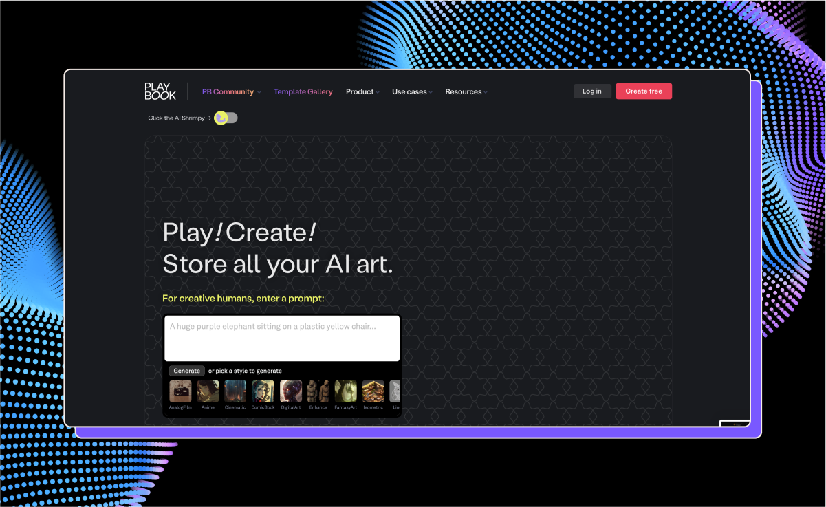
With Playbook AI, designers are finding a new ally in the quest for user experience perfection. This platform isn’t just another tool — it’s an ecosystem where artificial intelligence meets human creativity to foster innovation and streamline design workflows.
The key features of Playbook AI include:
- Generate AI art directly in Playbook with Dalle or Stable Diffusion, or connect Midjourney for automatic import.
- Store prompts right along with your creations: save every version of your AI prompts for all imported art.
- Visual workspace with 4TB storage for creatives: Never worry about running out of storage again.
For those who work in teams, collaboration is woven into the fabric of the platform, streamlining the design process through shared visual workspaces that enable seamless interaction and iteration among team members. Designers can work together synchronously or asynchronously, integrating seamlessly with popular design tools.
At Playbook, we understand the future of UX is not just in the pixels and code but in the very way teams collaborate and learn from each other — and the users they design for.
AI meets artistry: reach new heights in UX with Playbook
Harnessing AI is the key to elevating your UX design skills and streamlining your UX design process, and these seven tools are just the tip of the iceberg.
Whichever you choose to add to your designer’s toolkit, Playbook AI can support you, enhancing your workflows and facilitating collaboration as you work with AI to create stunning new designs.
Try Playbook AI now to see how it can revolutionize your designs while streamlining the process of creating them.
