Former professional athlete, turned artist and designer, James Coffman is incredibly talented in everything he does. We got to know more about his distinct aesthetic, what inspires his work, as well as some really cool projects he's been working on.
Can you tell us more about yourself and how you became a designer?
For about the first 24 years of my life, I was pretty much playing baseball. I played through college and then played professionally and signed with the Diamondbacks and played a few years there. After I was done, I didn't really know what to do but I always had an arts background, my mom's side of the family are all artists.
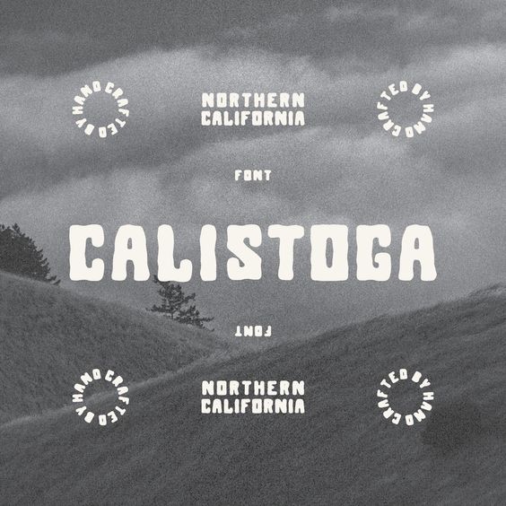
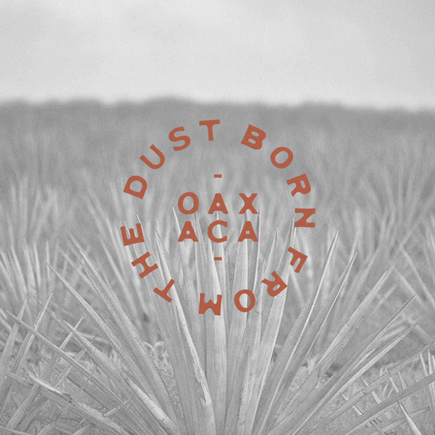
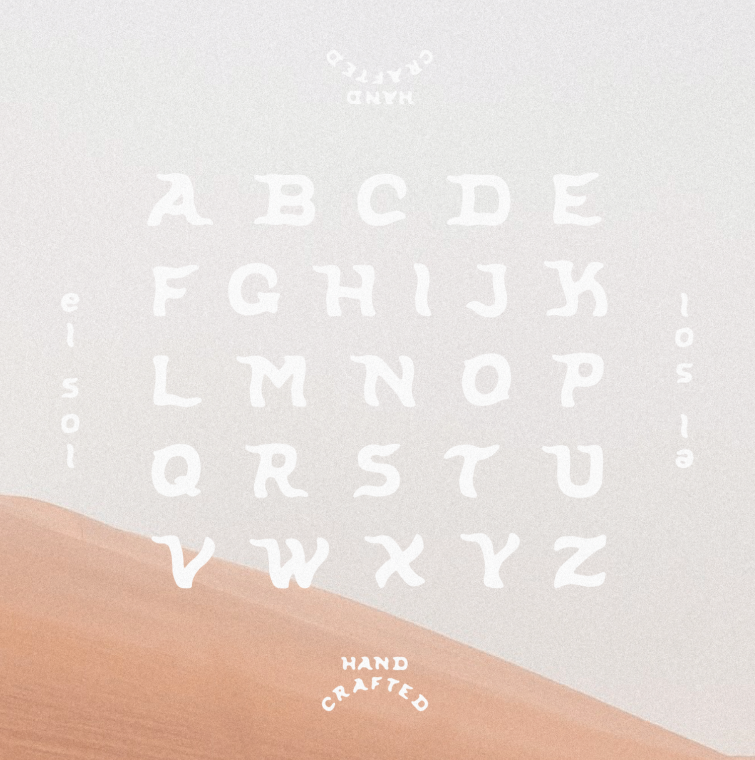
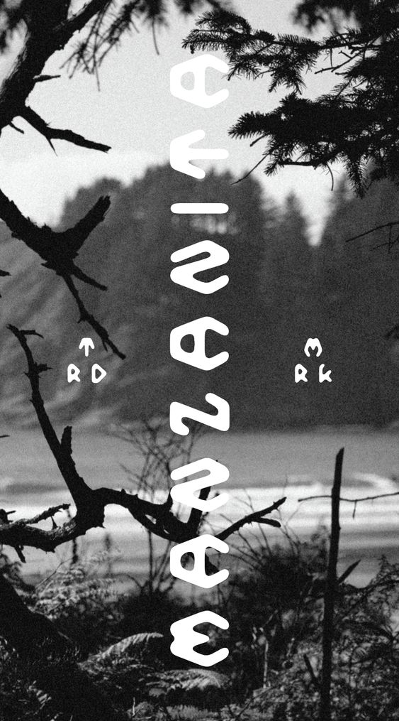
Then I went to design school at Portland State without really knowing what graphic design was and started freelancing on the side. I was making art and trying to figure stuff out as I went and that turned into me making fonts on the side which really caught on. It was never really the plan for them to replace my design income but that's what happened and it kind of freed me up to do more of whatever I want to do artistically which is nice.
That's really cool, it's not everyday that you hear about professional sports players moving into the design world.
Yes, I should probably be coaching community college baseball.
But you enjoy being a creative now?
I miss parts of it. Playing games in front of people is a rush that you don't really get anywhere else. But, it's a completely different world where you have to be on buses and in hotels and you don't really have a life outside of it. But with art, it is nice and I feel more grounded with more of a clear path.
You’ve dabbled into pottery, do you still practice multiple mediums or are you mostly focused on visual design now?
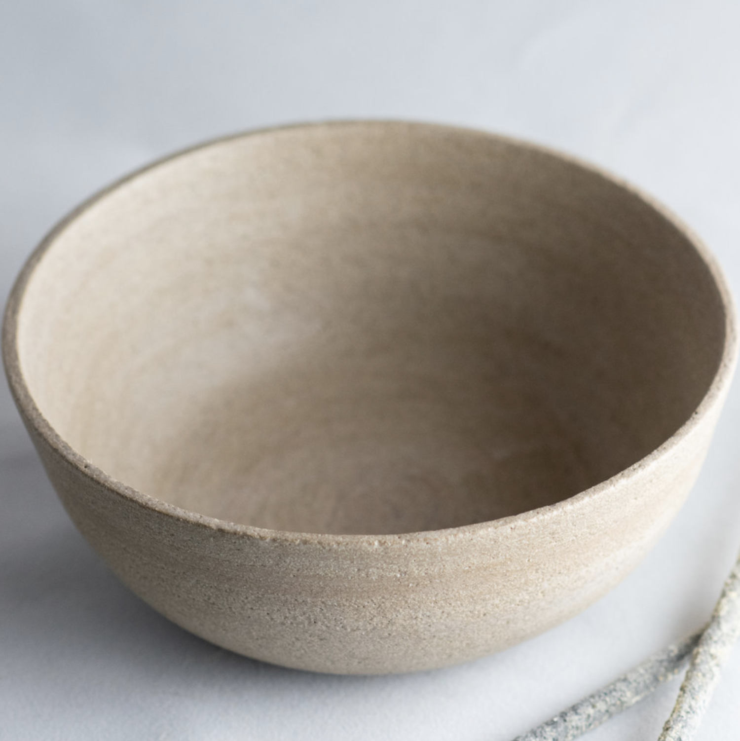
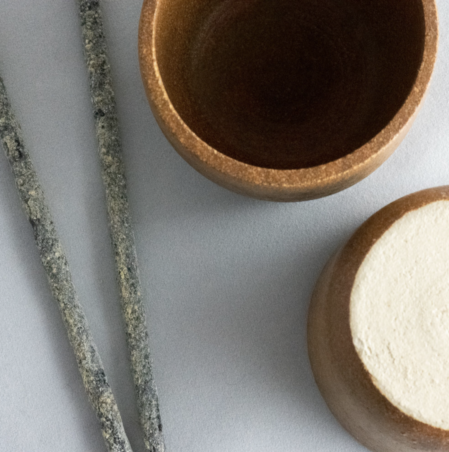
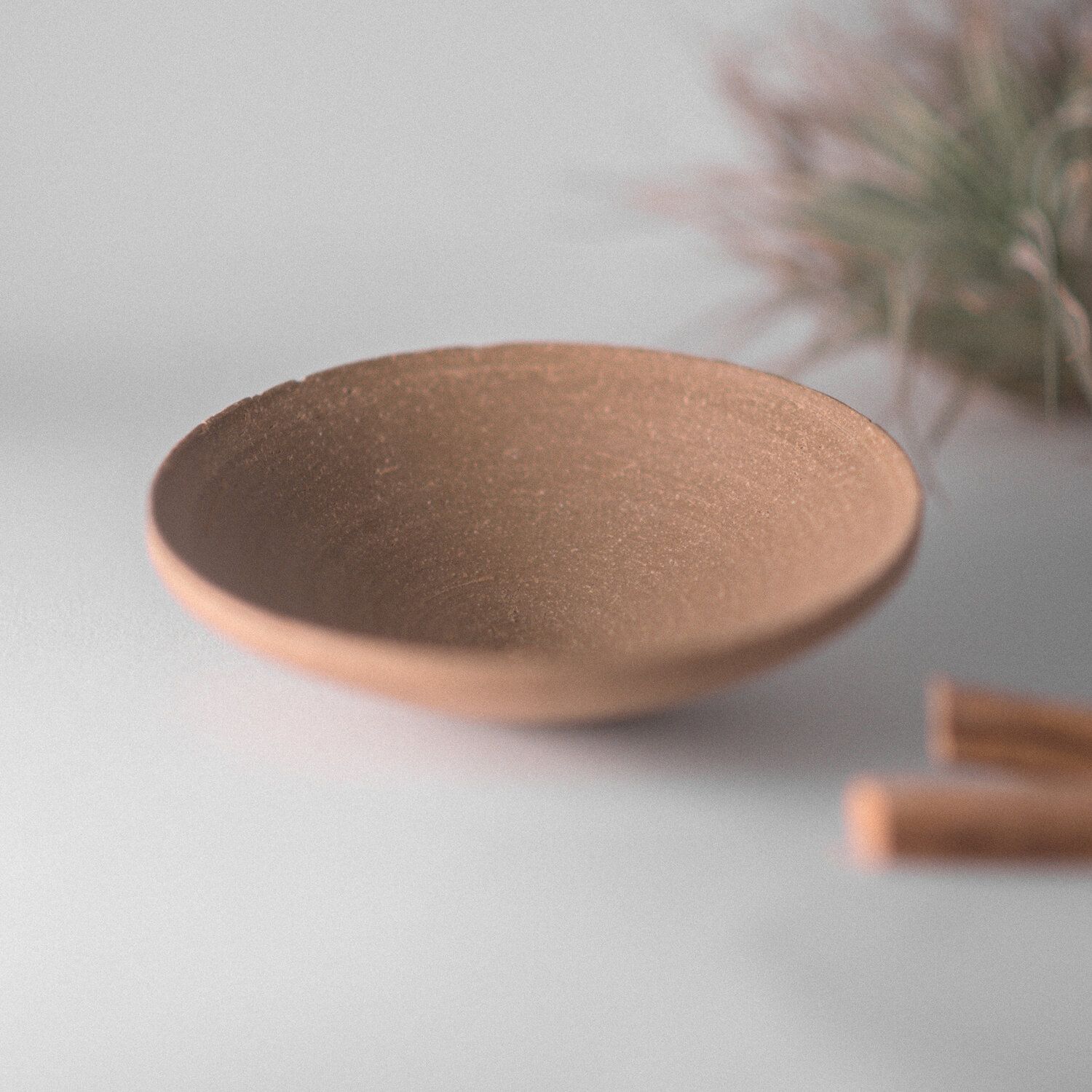
It really started out on the fine art side. My mom had a children's studio and always had pottery all over our house. I actually teach pottery classes to little kids, so that's also how I started getting involved with pottery and then that transitioned into the design stuff.
What is your creative process?
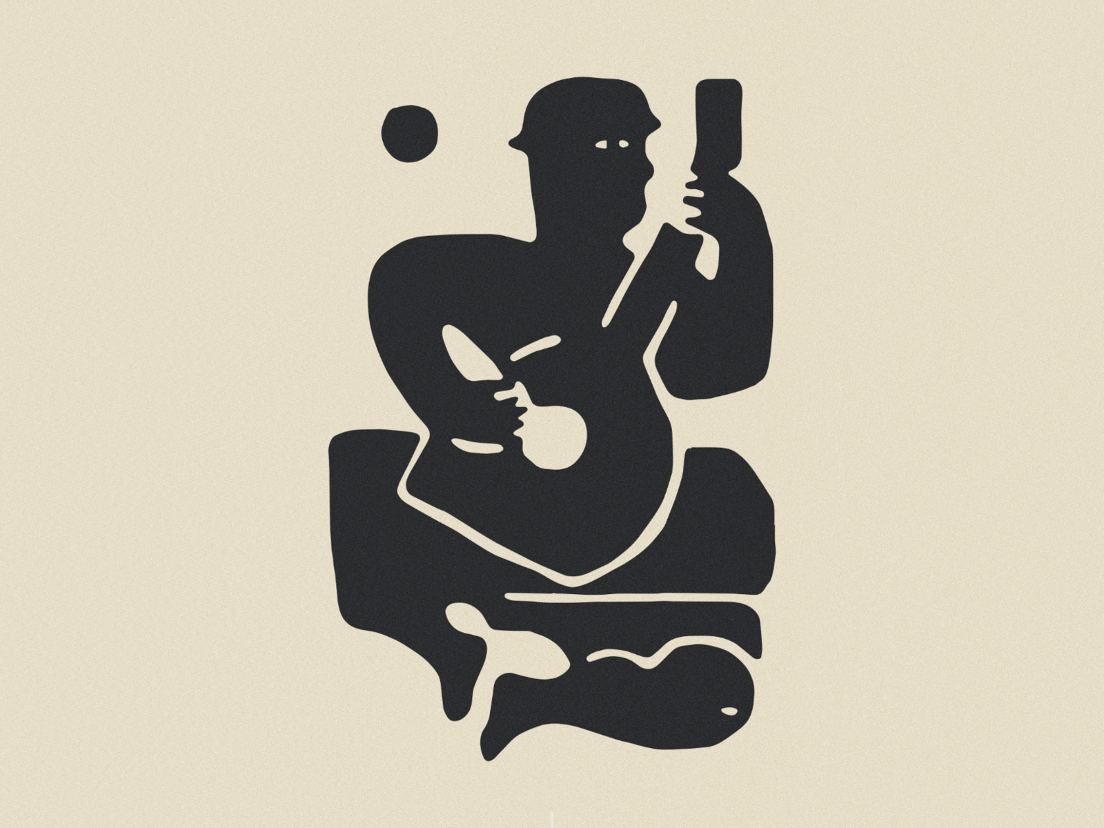
It's really all over the place but usually starts out with sketching. Sometimes I just randomly doodle things and then things come to mind but usually I'm looking at references, I’ve been looking at a lot of Fine Arts lately, I’m reading a book on Picasso right now, so a lot of my work is getting intertwined into that in a weird way. But yeah, usually just looking at references and then trying to minimize it or create it in my own way.
You have a very distinct aesthetic, is that something that took a long time to develop or do you feel like your style has remained the same?
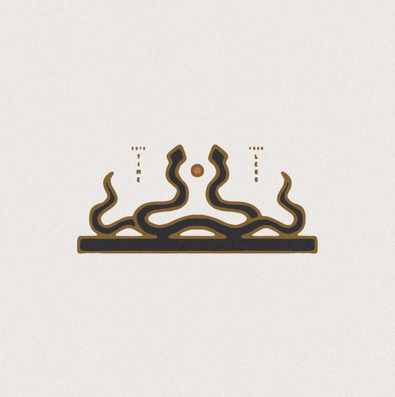
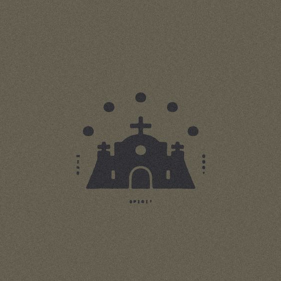
In design school they pretty much tell you to try a million different things so I've got some stuff that has super bright colors and clean lines, but for the last three years, it's been really stuck in what I'm doing. I like the aesthetic that I have, and I feel like I can really explore a lot of mediums with it.
How long does it usually take you to create a font?
I could probably knock a font out in a few days if I had to, but I really like to live with them and sit with them for a couple weeks and use them a bunch. If you follow me on Instagram, you know I'll use a font for maybe a month straight, which is how I iron out any details before I put it out to people. The technical side of it doesn't take that long. I've got a bunch of files of old fonts that never made it, they're like half done. So once I actually have an idea I like, I’ll knock it out.
Outside of art references, what else continues to inspire you?
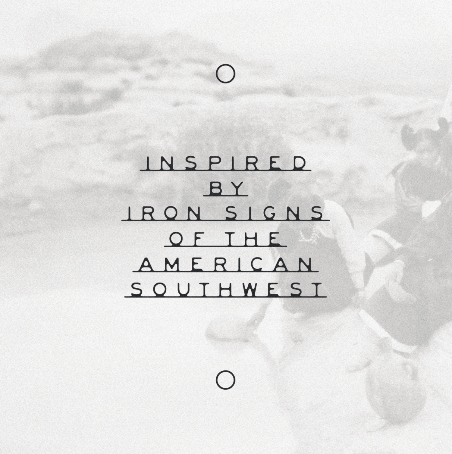
Everything. Like a good example is when I walk down San Francisco streets, there's a bunch of crazy old buildings and the architecture is amazing. Or, the old ads that are painted on the walls of buildings, I've made a few fonts based on things I've seen on walls before. So yeah, I think everything can be a reference if it hits you right.
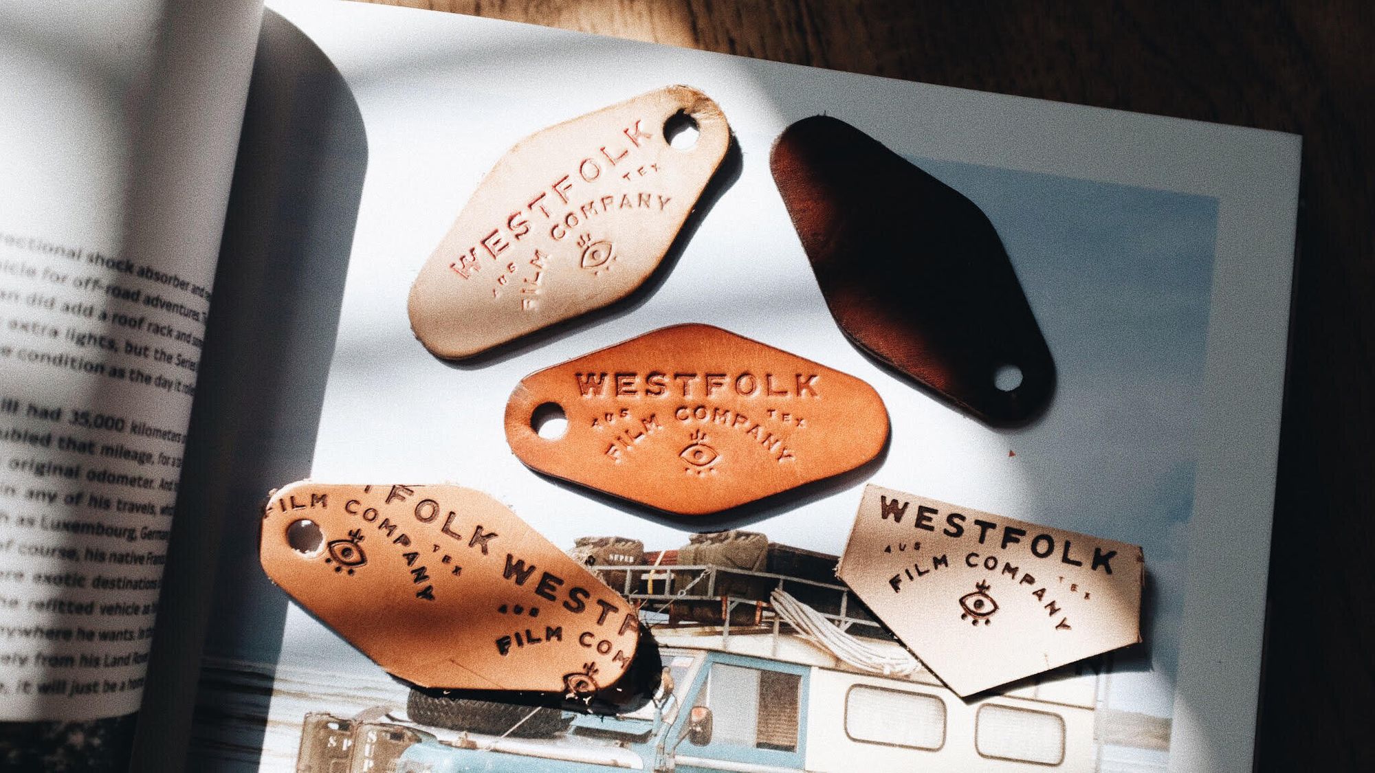
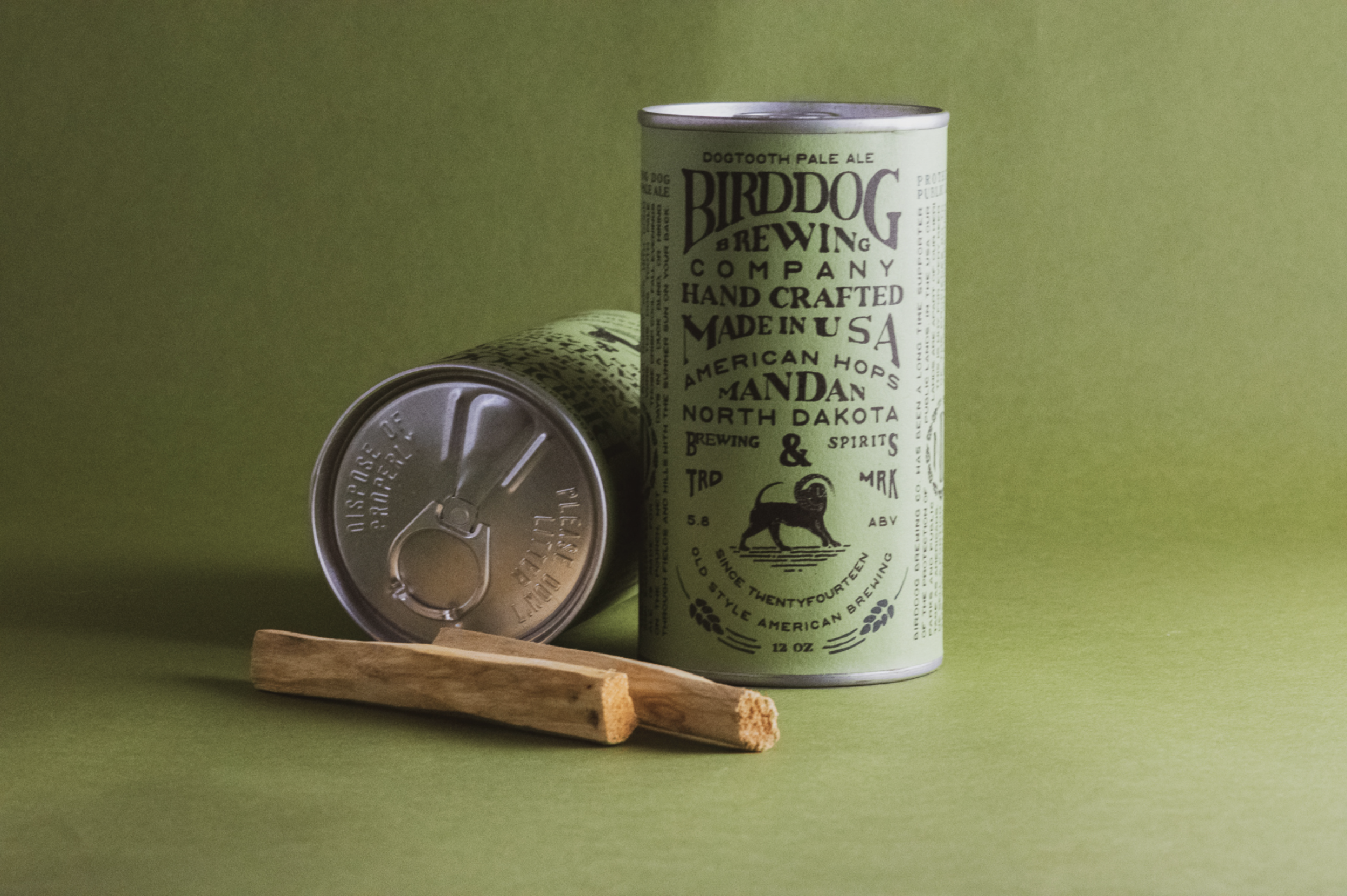
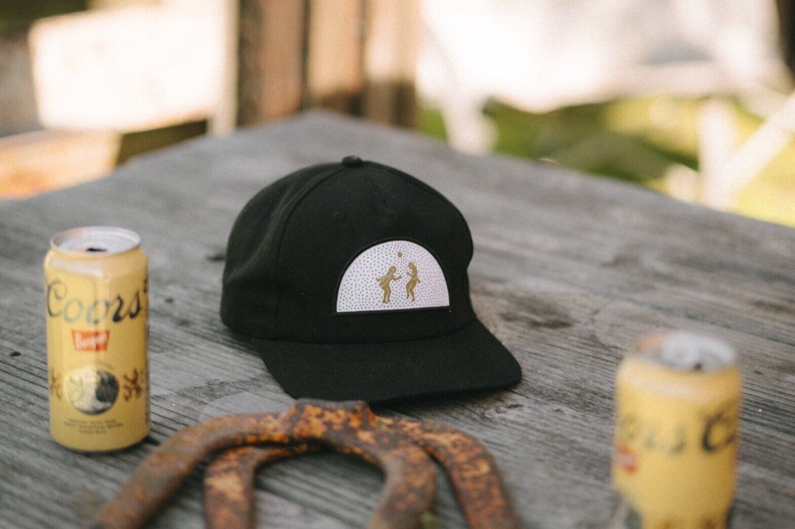
Do you have a project that you're super proud of or have you seen one of your fonts out in the wild that you're really stoked about?
There's been a lot. It's kind of weird because I don't have a whole lot of control once somebody buys a font, so they turn up randomly. But Lulu and Georgia, the furniture company, used my work for their fall collection a while back which was a nice surprise.
And Aaron Ball and Bryan Cranston from Breaking Bad started a mezcal company called Dos Hombres and they put out a special release model and used my work so that was awesome. I loved Breaking Bad so it was a really cool thing to see.
. . .
James is based in Northern California and available for hire. Check out more of his work on his site or follow along on Instagram.
