
The right font can do a lot for your design portfolio. It can help you present your different projects in a more cohesive style, reflect the personality of your portfolio, and generally strengthen your portfolio design.
Choose the wrong font and you may fail to attract clients’ attention. But how do you land on the right design portfolio font when there are so many options to choose from?
When faced with this question, you need to remember one thing — there’s no one way to choose a font for your portfolio. After all, the font is only one element of your overall portfolio design. There are, however, some tried and tested fonts that many pro designers use, and that’s what we’ll share in this article.
Once you choose the fonts that will complement your work the best, create a portfolio with Playbook using our platform’s free templates. Browse the Playbook Template gallery here!
Top 10 fonts to use in your design portfolio
Let’s get straight into some of the popular design portfolio fonts.
Open Sans

Created by Steve Matteson, a leading typeface designer, Open Sans is one of the most popular Google fonts. The font’s neutral, modern, and clean appearance makes it very versatile, allowing for perfect pairing with many other fonts. Open Sans is easy to read and it can be used both in headers and body text.
An example of this font’s use can be found on Charlie Montagut's portfolio site.
Futura
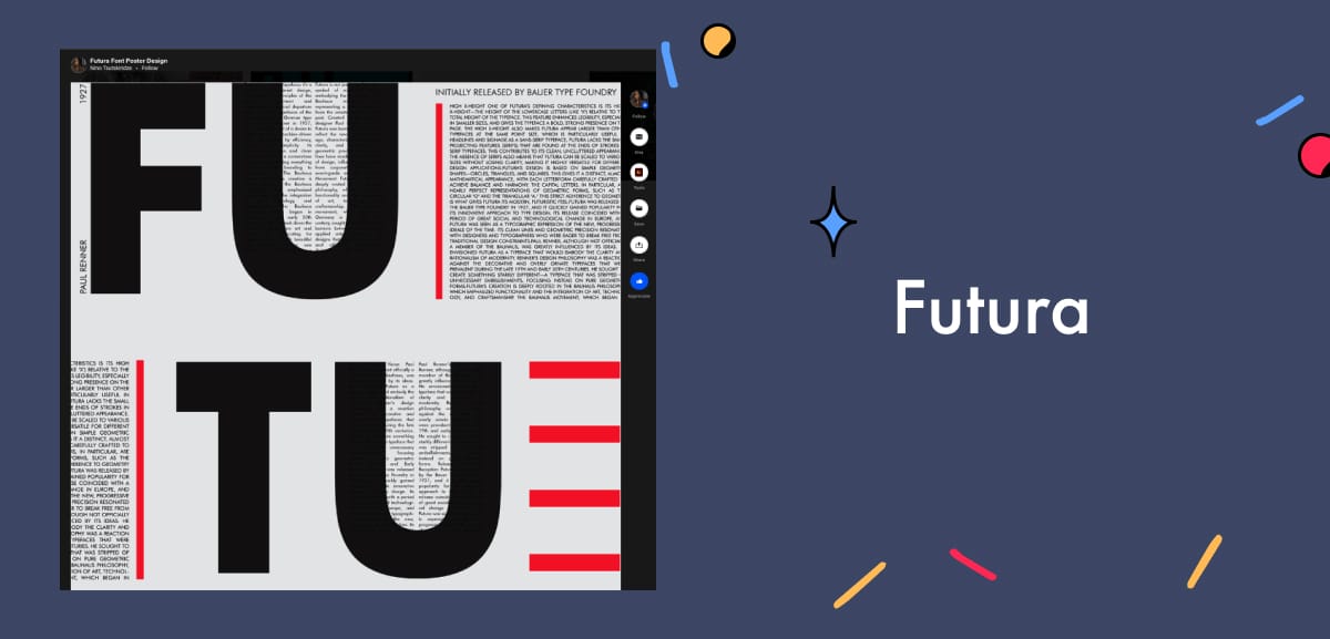
Futura was designed by Paul Renner in 1927, and it’s one of the most popular web fonts. Its overall look is based on simple geometric shapes like squares, triangles, and circles.
With clean, sleek lines, this free Google font is extremely versatile with a natural and contemporary look. You can use Futura for bold titles as well as body text — the font can give your design portfolio a futuristic feel without being too overbearing on the eye.
You can see the font in use on Nino Tsutskiridze’s Behance portfolio site.
Proxima Nova
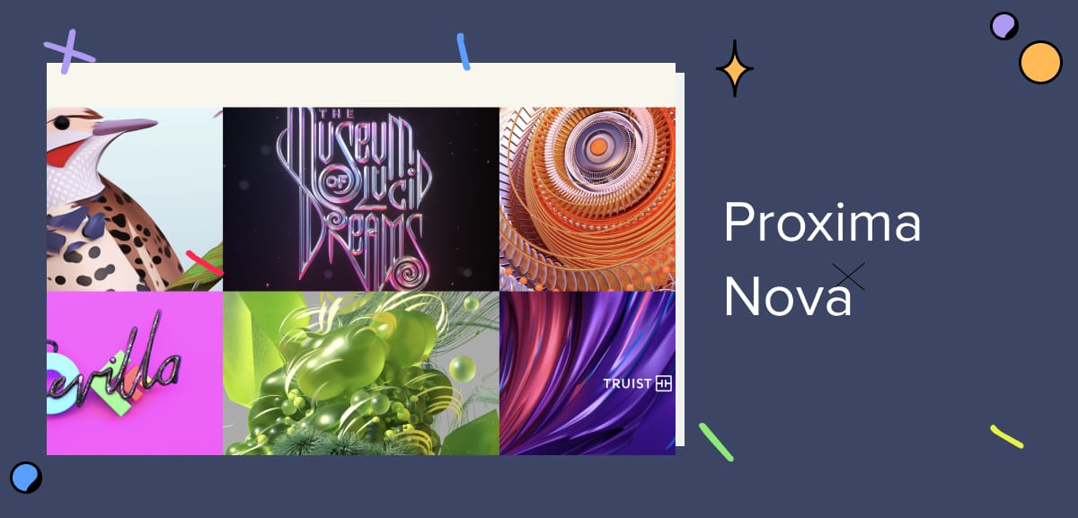
Often described as a hybrid font, Proxima Nova bridges the gap between Futura and Akzidenz Grotesk. It combines modern proportions with a more geometric appearance. The font was designed by Mark Simonson and released in 2005.
Unique styling is at the core of Proxima Nova’s look. The font is modern with a futuristic element. However, it also exudes a vintage feel to give an overall look that’s playfully creative and lighthearted. The font pairs well with Georgia, Adobe Garamond, Futura PT, and Helvetica Neue.
Despite its recency, Proxima Nova has gone on to become popular worldwide. It’s represented in many portfolios, including that of Lucid Style.
Playfair Display
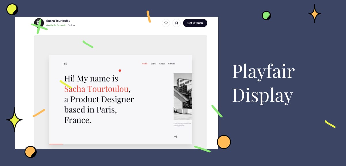
Playfair Display is a classic serif font, and another free Google font. Available in bold, black, and regular, and best suited for headers and titles, the font pairs well with many sans serif fonts. For example, Playfair Display goes well with Roboto, Georgia, Futura, and Lato.
This font was created by Danish type designer, Claus Eggers Sorensen, and it was influenced by 18th-century high-contrast print letterforms. Playfair Display’s black variant, in particular, is perfect if you want your portfolio to make a strong impression.
The font has been used with great success in portfolios such as Sacha Tourtoulou.
Lato
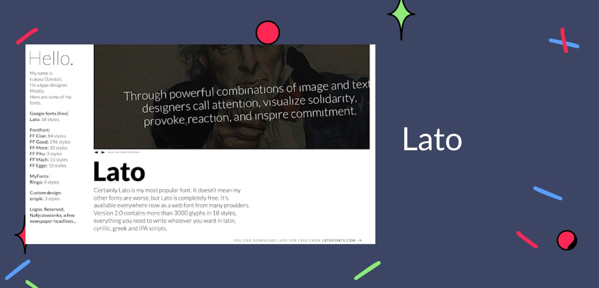
Lato, a sans-serif font, was designed by Łukasz Dziedzic in the Summer of 2010. In fact, the word “Lato” means summer in Polish. In a nod to its name, this font’s round edges give a warm, approachable feel.
The free Google font includes styles that range from thin to ultra-bold. That said, the font does have some stylistic features that are only visible in larger sizes, so you will need to keep that in mind. Lato can be paired with Open Sans, Playfair Display, Roboto, Proxima Nova Montserrat, and Georgia.
You can check out Lato on Łukasz Dziedzic’s site.
Inconsolata
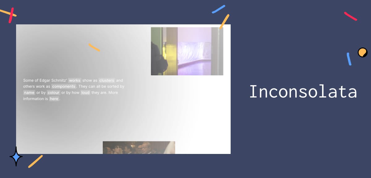
This font is unique for being the only monospaced font on this list. In 2001, designer Raph Levien observed the design of Luc(as) de Groot’s “Consolas,” a monospace font that was later used by Windows Vista. In Raph Levien’s words, the observation showed him that “monospaced fonts do not have to suck.”
Inconsolata has a distinctive style that will add an eccentric touch to any design portfolio. Although the font was designed for printed code listings, lots of designers and artists have managed to use it to great effect on websites and portfolios. Edgar Schmitz‘s site is a great example.
Titillium

An academic brainchild of several professors and experts, Titillium was created inside Accademia di Belle Arti di Urbino as an educational project for a typeface design course. This free Google font is dynamic and particularly interesting. Its light and regular forms are elegant and stylish. On the other hand, its black and bold forms have a solid personality, yet they still manage to give a playful and approachable feel.
The versatile font is best suited for headlines and titles as well as body text. When it comes to pairing, Titillium goes well with lots of serif and sans-serif fonts. No wonder it’s popular! The font has been successfully used by designers and creative agencies alike. Many different kinds of creatives choose to build their portfolios on Playbook. Have you signed up yet? Check out how others have showcased their masterpieces for free here.
Didot
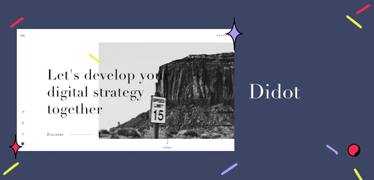
Want to add an aspirational feel to your portfolio? Or maybe a splash of luxury and elegance? Didot and its refined version, Linotype Didot, have got you covered. These two fonts will instantly transform your portfolio, making it more evocative.
The neoclassical serif fonts are based on the typefaces developed by the Parisian Didot family in the late 18th to early 19th century. However, the Linotype Didot was later refined by Adrian Frutiger. There’s no doubt that Didot — whether used in headings, titles, or body text — can add a certain level of opulent style to any website as shown by Everess.
Helvetica Neue
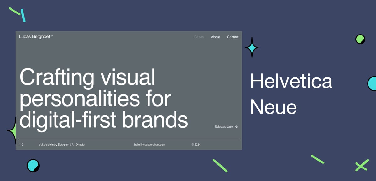
This sans-serif is described as “a melding of aesthetic and technical refinements that result in superior design proportions, improved legibility, and an expanded range of uses beyond the original Helvetica typefaces.”
Compared to the original Helvetica typefaces, Helvetica Neue has heavier punctuation marks, more structurally unified heights and widths, and increased spacing in the numbers. All these changes have made it easier to read.
As with many sans-serif fonts, Helvetica Neue is versatile. But what makes it special is the fact that you can not only combine it with a wide range of fonts, but also typefaces from other scripts such as Chinese, Korean, and Devanagari. The font goes well with others like Georgia, Proxima Nova, Trade Gothic, Open Sans, and Museo Sans.
See Helvetica Neue in action on Lucas Berghoef’s website.
Caslon
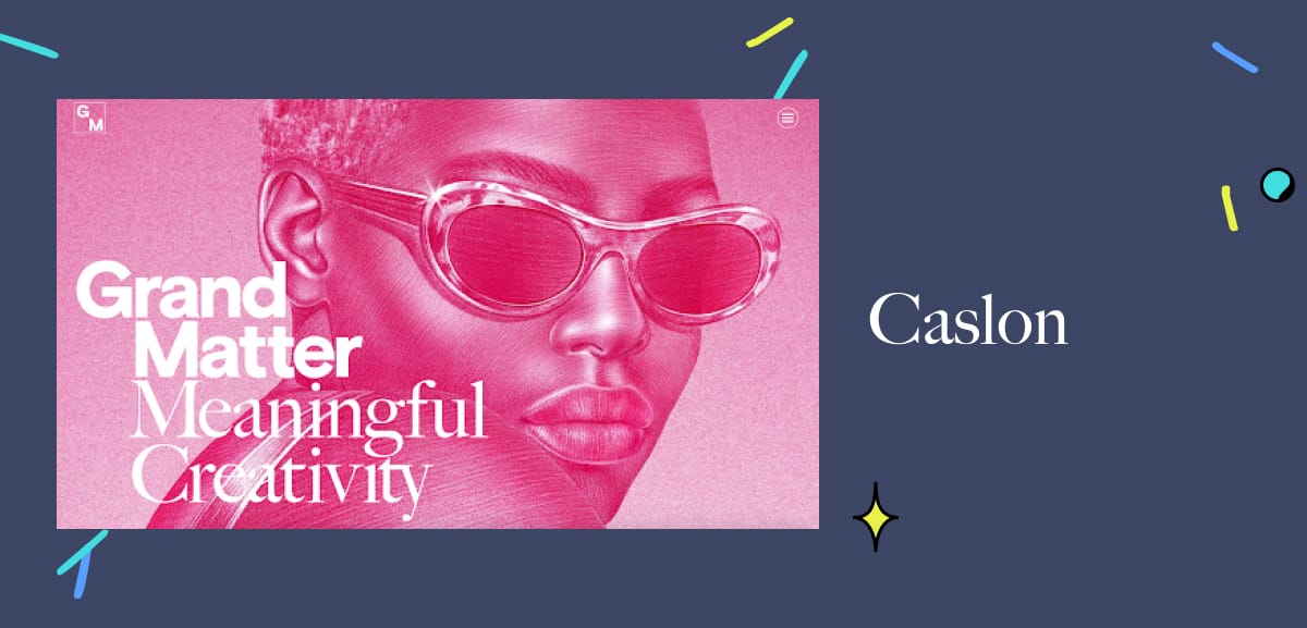
Caslon is the name given to a family of serif fonts created by London-based designer William Caslon, in the 18th century. This font family is perfect if you want to combine authoritativeness with a warm style that feels approachable.
Great when used in headers or bodies of text, Caslon is ageless; it has survived and thrived for a long time, and that’s likely not going to change anytime soon. You can check out Grand Matter‘s site to see how you can use this versatile font in your portfolio.
This list is in no way exhaustive, but it should give you a good starting point for choosing a font that enhances your design portfolio. We hope the portfolios above have served you well in giving you that boost of inspiration you may have needed. Create your own portfolio with Playbook for free here.
If after going over this list, you still find it hard to select a font — which is totally possible, given how great all these fonts are — you may find this next section helpful.
Serif vs. sans-serif fonts: which should you use in your portfolio?

Choosing between a serif and a sans-serif font may be all it takes to set your design portfolio’s tone and personality.
Because of their use of serifs (those feet at the end of letterforms), serif fonts tend to have a classic feel that exudes sophistication and elegance. In contrast, sans-serif fonts (quite literally the fonts “without serifs”) typically look more contemporary and cleaner. They tend to give a more informal and relaxed feel.
Sans serif fonts can work really well in digital contexts as they provide excellent readability on screens, and come across as approachable. The modern look is best suited for web design, digital presentations, and portfolios targeting younger audiences.
Serif typefaces are best for when you have longer text blocks like project descriptions or personal statements. This is especially true if you’re working in book publishing, academic design, or with brands that have a more traditional, authoritative positioning. Well-established brands often use serif fonts to communicate traditional values.
The type of font you select can also depend on the context, and it is ok to mix the two! The best advice is to balance your type selections to create a good visual hierarchy. But let’s admit it, we all have a favorite. So what team are you on? Sans serif or Serif? Give your preferred font style a try by using it on your own free Playbook portfolio.
Create your own design portfolio with Playbook
As a designer, a lot rides on how well you present your portfolio. We hope this article will make it easier for you to choose a font that makes your portfolio more engaging.
Having said that, the font is only one part of the design portfolio. To get some inspiration for your portfolio’s overall look, be sure to check out these excellent design portfolio examples, complete with links to our top picks of free portfolio templates and illustrations.
And if you need a no-stress solution for storing your digital design portfolio, Playbook is a great option. The intuitive, creative cloud storage platform allows you to organize your files and share them beautifully with your clients. Plus, you don’t have to worry about running out of space. As social media manager Diva Wong puts it, “Playbook is all about making life easier!”

